
1. Figure out which charts best represent your data
You know how we just said you’ll be faced with tons of options to represent your data? We weren’t kidding there are bar charts, column charts, pie charts, line charts, scatter plots, waterfall charts, and so many more.
However, not all of them will be the best fit for the data that you want to represent. For example, a line chart is excellent for analyzing trends while a pie chart is effective for looking at a snapshot in time.
Not sure which chart is the best choice for you? Your best bet is to play around. Create a few different charts, look at the results, and see which ones make the most sense for displaying your data in an easily digestible manner.
With so many options, we couldn’t possibly dive into every chart type in detail here. So, instead, we’re going to dip our toes into the dashboard waters by focusing on the step-by-step process for creating one specific type of chart: a column chart.
We’ll stick with the same budget data set that we used above. Our goal is to create column charts that will display how much we spend on each individual budget line item per month in the first quarter. This means that we’ll end up with separate charts for electricity, gas, phone, etc.
2. Filter your data
When creating a chart, you’re not going to need to use all of your data at once you’ll need to filter through it to focus on only the pieces you need at that given time.
The easiest way to do this is by using the “Filter” option within Excel. For example, we want to filter by item type and only see numbers related to our electricity expenses.
To do that, we’ll highlight the entire data set, click the “Data” ribbon in the toolbar, and then click the “Filter” button. When doing so, you’ll see that little arrows appear next to your column headers. If you click one of those arrows, you’ll be presented with a drop-down menu that you can use to filter your data.
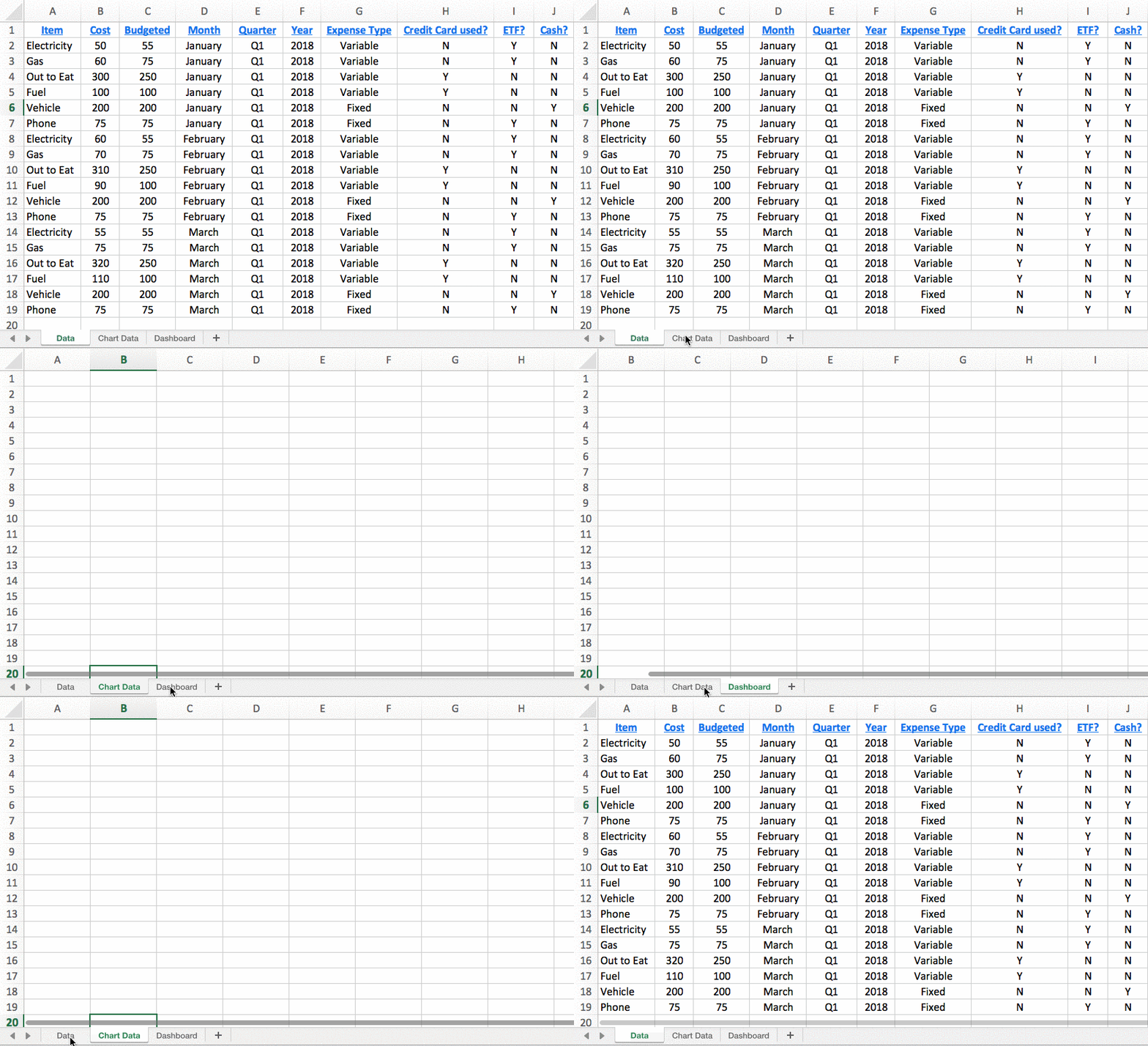
When you’ve filtered down to only the data that you want, highlight all of the cells of data, hit “copy,” and then paste only those rows into your “Chart Data” tab of your workbook. That’s the tab that you’ll pull data from when building your charts.
Why can’t you just select data from your regular “Data” tab? Well, put simply, because even though you’ve filtered the data, those other irrelevant rows are still included there (albeit hidden) meaning they’ll throw things off in your chart.