
3. Build your chart
Now that you have only the data that you need, you’re ready to begin building your chart.
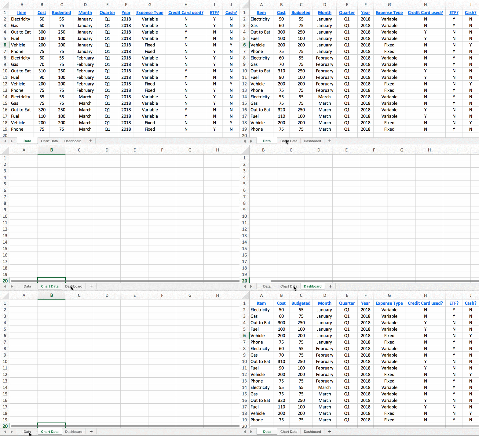
Click on the “Dashboard” tab of your worksheet, click the “Insert” button in the toolbar, and then select the type of chart you want from the menu. In this case, we’re going to use a clustered column chart.
When you insert the chart, you’ll see a blank box. Don’t worry you haven’t screwed anything up. We’ll cover how to get your data to appear there in the next step.
4. Select your data
Now that you have that blank box inserted in your “Dashboard” tab of your workbook, it’s time to pull some data in.
To do so, right-click on that box and then choose “Select Data.” After that, navigate over to your “Chart Data” tab (where your filtered data is living) and highlight all of the data that you want to display minus the column headers. In this case, we’re selecting the “Item” and “Cost” data, since the purpose of my chart is to show how much we spend on electricity each month.
That data that you just selected is for the vertical axis. But, you still need to select your data for the horizontal axis of your chart.
To do that, click the button within the “Horizontal Axis” field of the “Select Data” popup and then highlight the information you need for the horizontal axis in this case, the months.
After doing so, hit your “Enter” key, click “OK,” and then head over to your “Dashboard” tab to ensure that your chart populated with that data.
5. Double-check your data
At this point, it’s wise to take a quick look at your chart and make sure that nothing looks off.
Mistakes can happen. So, it’s worth it to take the time to ensure that your chart is pulling in your data correctly.
Does something look off?
Do some troubleshooting to figure out where you went wrong.
6. Polish your chart
Here’s the fun part when you get to put the finishing touches on your chart.
From changing the colors to match your brand to adding labels, titles, units, or any other information that is required, you can polish up your chart by double-clicking on the chart area and then using the options in the toolbar (there are buttons up there for everything from “Add Chart Element” to “Change Colors) to make your changes.